Introduction for "Curated Design Explorations":
Welcome to my 'Curated Design Explorations' showcase—a testament to the invaluable learning experiences that have fueled my growth as a designer.
Here, I showcase a mix of passion projects and design tasks that didn't lead to the outcome I had hoped but, through reflection and determination, have been transformed into valuable lessons.
These curated explorations not only showcase my creative journey but also highlight my resilience, adaptability, and unwavering commitment to crafting exceptional user experiences. Join me as I turn setbacks into stepping stones towards design excellence.

Platform
Mobile App (iOS and Android)
Tools
Figma, Adobe Creative Cloud, Microsoft Office
Industry
Charity and Social Media
Timeline
4 hours
Give Star | August 2023
My Role
As a UX Designer, my role was to redesign the GiveStar charity fundraising app's sign-up and onboarding flow to address user abandonment and low conversion rates. The goal was to create a seamless, user-friendly experience that builds trust, enhances user satisfaction, and encourages positive word-of-mouth.
High Fidelity mock up

Objective
Design Task: You are tasked with redesigning the GiveStar app sign-up and onboarding flow. The current experience is resulting in user abandonment and limited conversion from sign-up to campaign creation.
Your goal is to create a seamless and user-friendly process that improves sign-up completion and signposts users to campaign creation, builds trust, enhances user satisfaction, and encourages positive WoM.

Annotation of the design task brief
The Challenge
The primary challenge was to create an engaging and streamlined onboarding process that captured users' attention, built trust, and motivated them to complete the sign-up and create fundraising campaigns. Additionally, the design needed to cater to the preferences of the app's target audience, Millennials and Gen Z.
The Problem
The existing onboarding and sign-up experience for GiveStar was lengthy, aesthetically poor, and failed to showcase the app's most appealing features and charities. This resulted in high user abandonment rates and limited conversion from sign-up to campaign creation, hindering the app's growth and impact.
Metrics

Time constraint
Spend no longer than 4 hours on this project

Interview format
1 hr presentation. (30 mins to talk through your response to the brief and 30 mins of Q&A).

Industry
Charity and social media
2. UX AUDIT
Through this process, I evaluated the existing onboarding and sign-up experience, identifying pain points and areas for improvement.
Identifying with the target users, I was able to critique the processes and compare them to industry standard equivalents.
The onboarding process is lengthy (Could affect the bounce rate)
Doesn’t showcase the most appealing features/ charities (Name-dropping is useful here)
Aesthetically poor (Too much whitespace)
By addressing these pain points, we can enhance the overall user experience and drive meaningful engagement.
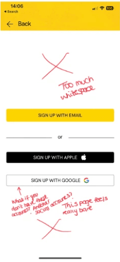
Screenshot of my annotations of the flow
3. Competitor Analysis
To gain insights into successful practices, I conducted a competitor analysis focused on the onboarding and sign-up processes of similar platforms. By identifying effective elements, I could incorporate them into the redesign, aligning with evaluation criteria like user-centered design and visual appeal.
Sidenotes:
Go fund Me: Browse Fundraisers: non-committal (who is on GiveStar’s 170,000+ roster of charities)
Millennial apps Inspo: Tumblr Profile building while onboarding, (interests) more tailored experience (As a millennial I also grew up on social media)

Breakdown of features across other charity apps
4. User Interviews
Conducting user interviews with friends and network members provided valuable insights into their needs, motivations, frustrations, and preferences. This first-hand feedback was crucial in understanding the target audience's perspective and shaping the redesign accordingly.
User 1 found some screens "unprofessional," "plain," and "basic," emphasizing the importance of a visually appealing design that aligned with their expectations. This feedback highlighted the need to enhance visual aesthetics while maintaining simplicity in the sign-up process.
User 2 highlighted the need for clearer navigation buttons, as they accidentally skipped certain steps due to confusion about swiping. This insight underscored the importance of prominent navigation cues for a seamless onboarding experience.
Incorporating these insights into the design decisions ensured that the redesign addressed user concerns, met their expectations, and delivered a user-centered experience tailored to the target audience's preferences.

Screenshot from message exchanges from interviews