
Project 1: Self-Service Kiosks Redesign
While I was a UX Design student, I supported myself by working at Stradivarius. In this role, I was uniquely positioned to have a hands-on approach to learning and implementation. I noticed that my eyes were now open to the need for good UX design in every area of life- but specifically the shopping experience. Where I once saw minor hiccups, with a renewed perspective, I saw opportunities to solve glaring usability problems.
Being the curious, busybody that I am, I shared those findings with my retail manager and drew up a UX Audit report. Here is that journey:
Tackling UX problems in the wild: Unfrustrating the user experince of the Inditex self-kiosk systems
Role
As a Cashier, merchandiser and sales assistant, I noticed repetitive usability issues that led to user frustrations with company systems. In a self-initiated project, I integrated my UX design skills by:
Conducting observational research and usability audits to improve the self-service kiosk user experience.
Using user Journey maps, I proposed a more efficient way to maintain product data in the stock and inventory management systems.
Context
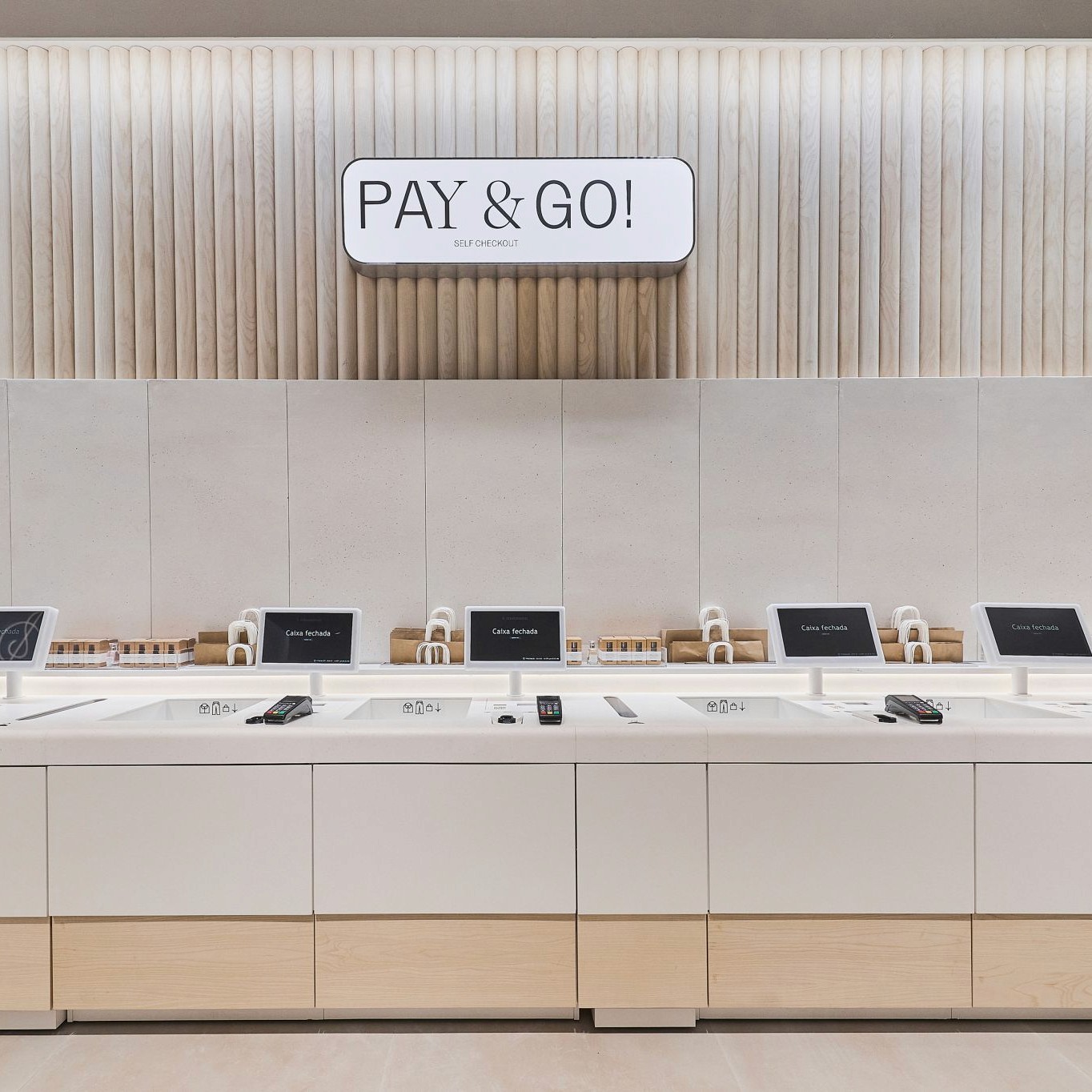
A prominent fashion retailer and sister company to Zara, Stradivarius has implemented self-service kiosks in all of its stores. However, the kiosks were causing significant confusion, resulting in frustrated users, incomplete transactions, and increased dependency on store staff for assistance. (I saw these oftentimes emotional outbursts as I was the one to often help frustrated customers).
The kiosks were meant to improve checkout efficiency by freeing up staff from always being at the cash desk and diverting traffic away from the cash desk to the self-service kiosks. However, this resulted in user confusion, creating a need for frequent staff intervention. I took it upon myself to redesign the customer journey, focusing on reducing friction and improving the user experience.
Pain Points
When familiar patterns ≠ the same results
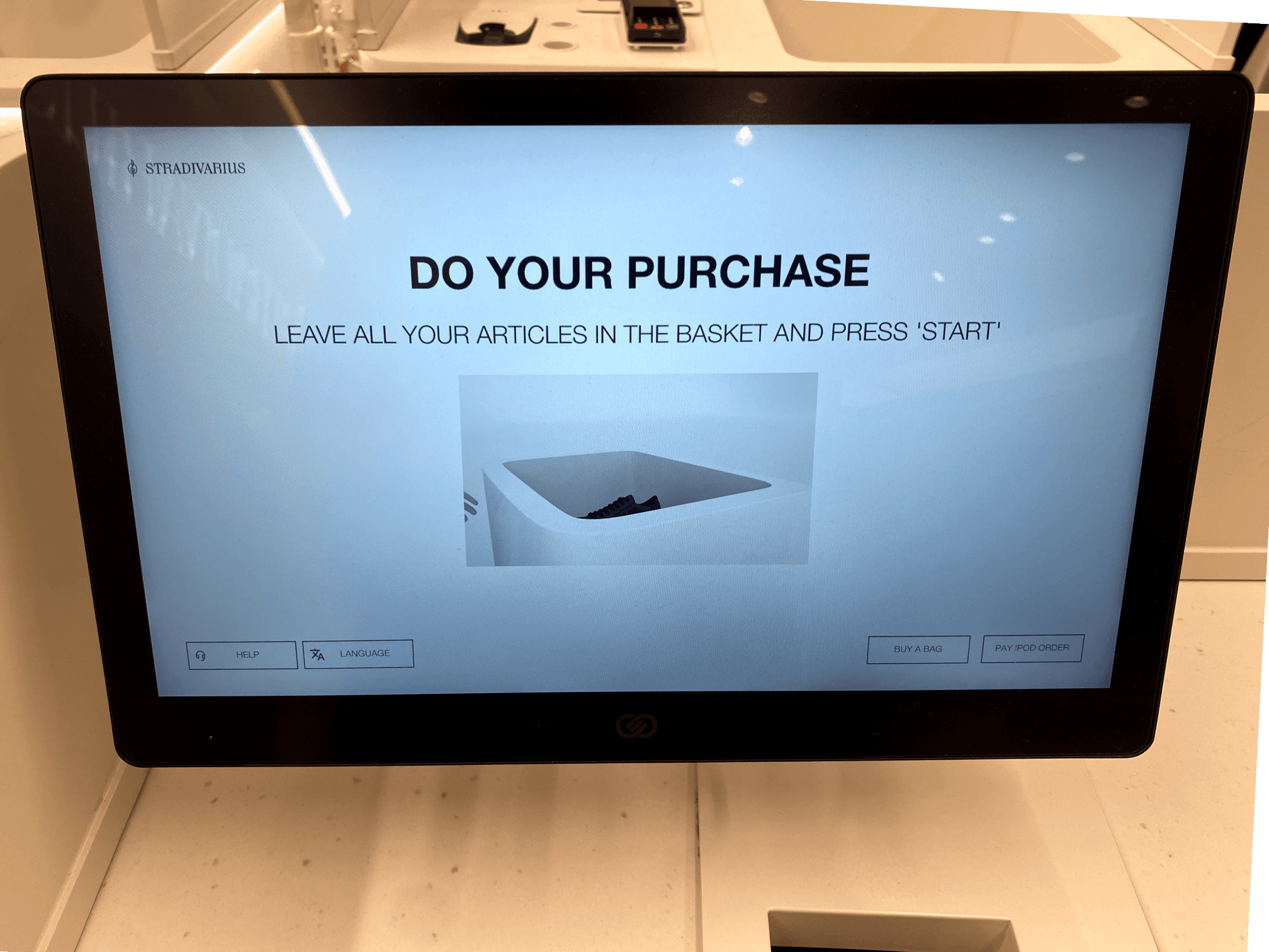
Observation: I began to notice that customers using the self-checkout for the first time would make attempts to use it without reading the onscreen instructions.
This became evident when many first users tried to scan the barcode. The first stumbling block was the familiar expectation to scan items like you would at Tesco.
Problem: Scanning barcodes is a universal practice and should be a consistent design pattern. However, this lack of usability sometimes causes customers to get frustrated and abandon their purchases.
Misleading on-screen instructions
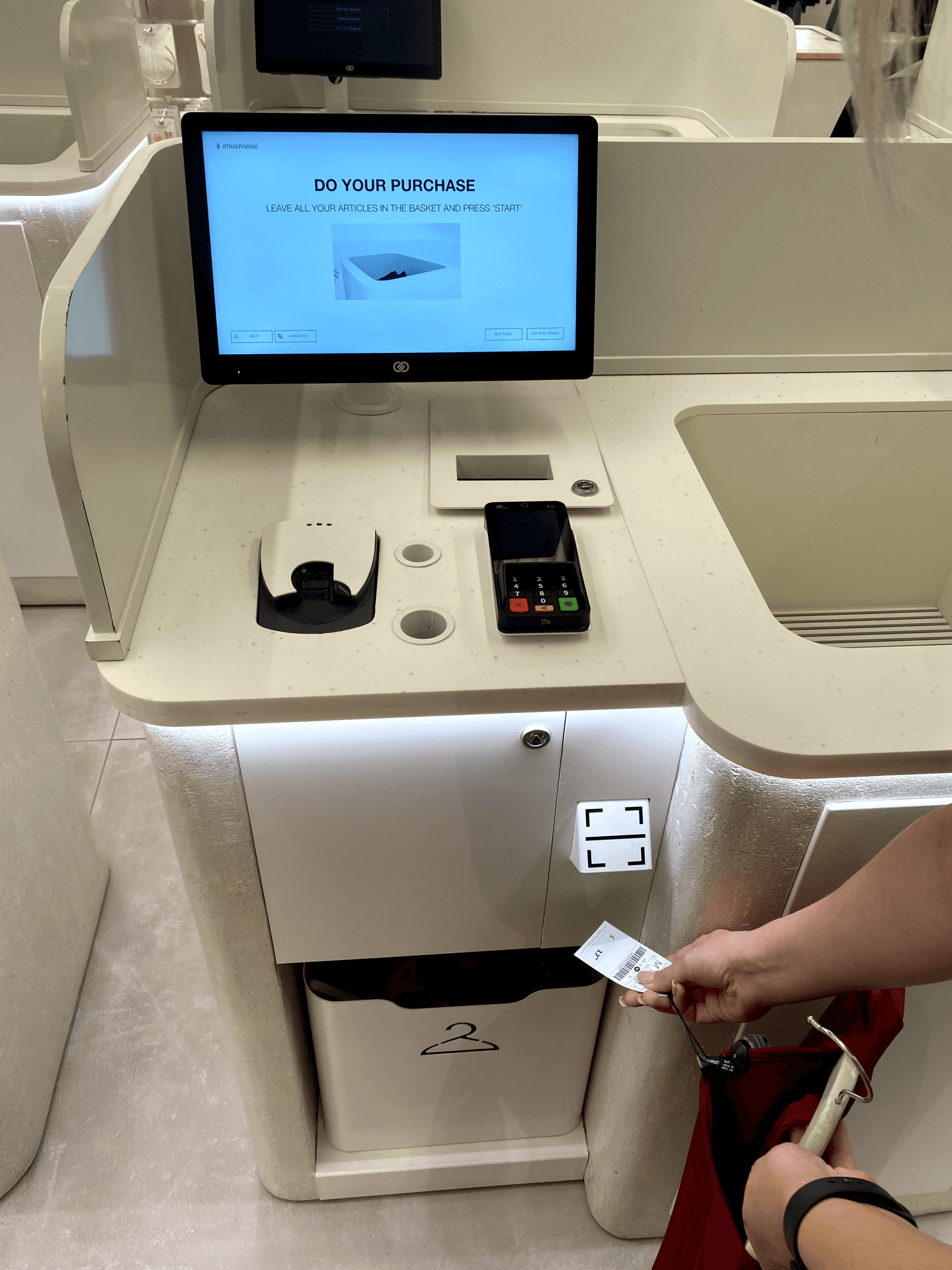
Error: At a closer look, another issue I noticed was an error on the onscreen instructions signposting users to press "start" when there is no start button or CTA.
With middle-aged and senior customers, there was a notable confusion about the location of the basket, despite there being a video tutorial.
These were multiple challenges a customer faces before even passing the 1st screen, it has led to a lot of complaints voiced about the difficulty and frustration of using the self-service kiosks.
Poor typography
Observation: The following screen is where customers can see their items and make any edits before paying. If a customer needs a bag, it needs to be added during this step.
Problem: Due to the poor legibility of the typeface, many customers miss this and end up taking bags, not knowing they are not free. This led to daily complaints about not seeing an option to add a bag (top left), especially when later asked to pay for a bag. This is the same critique for the option to choose a gift ticket.

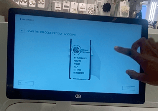
No directions on the account screen
Another stumbling block I observed reoccurring with customers was not knowing how to proceed past the account screen. As this step is only for customers with an account on the Stradivarius app, many shoppers who didn't have an account faltered here.
Problem: Again, due to the low legibility of the CTA button and the ambiguous header, the majority of customers are left perplexed because not enough instructions on how to proceed are provided.
Payment issues
Observation: The lack of instruction was a recurring pain point I experienced with customers. Many steps of this process were not informative and greatly elongated the goal of making a purchase.
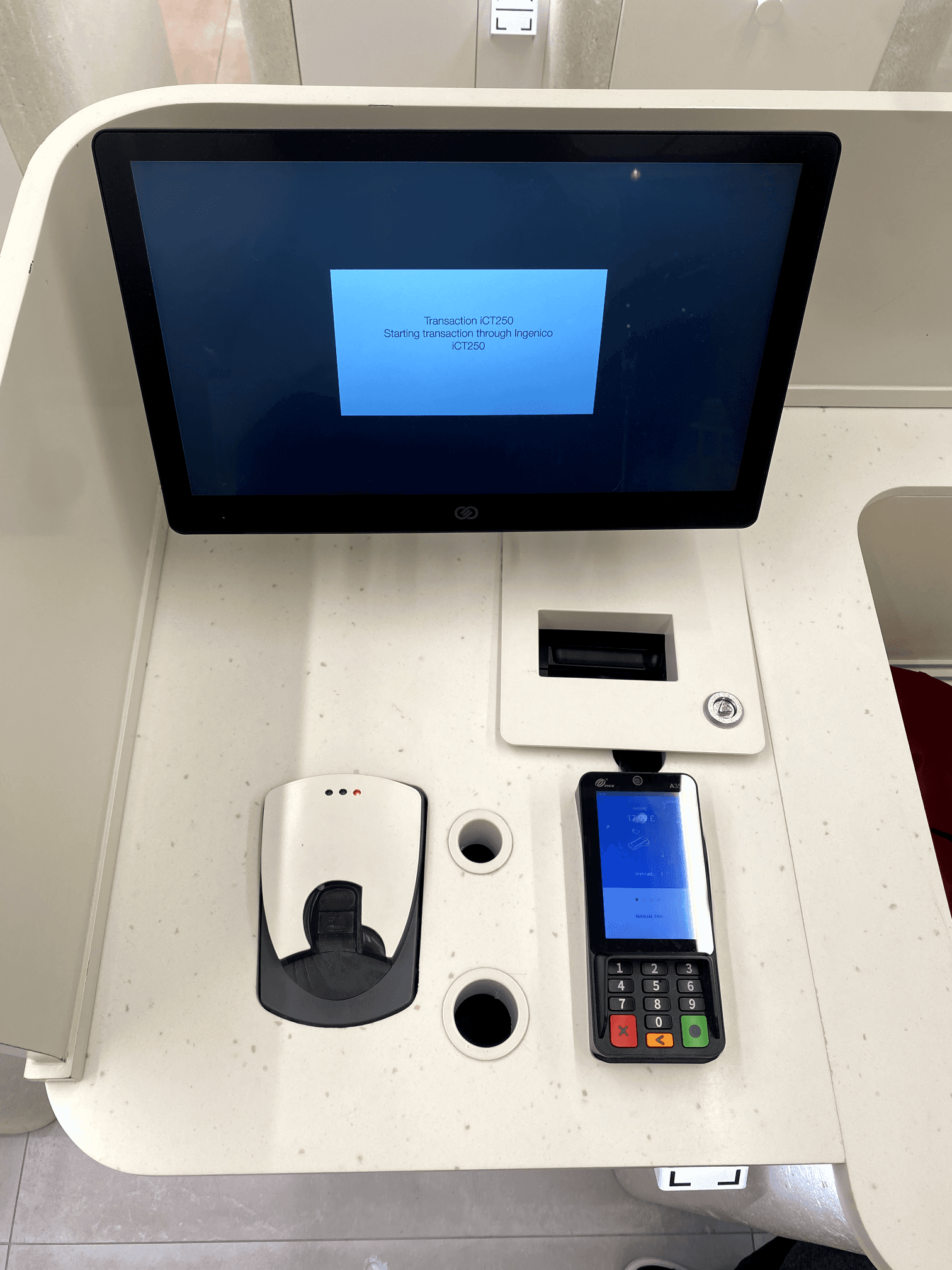
Problem: Up until this point, all of the focus has been on the LED touch screen; there is no signalled to pay now using the card reader to an unobservant user.
Suggested improvements: Signal to users that they can now make a payment on the card reader below.
Challenge
The self-service kiosks at the client’s stores were designed to offer a seamless, fast checkout process but had become a point of frustration for customers.
Key pain points included:
Unclear instructions
Poorly designed navigation
Confusing scan-based interactions, leading to a high rate of user abandonment.
My challenge was to overhaul the kiosk interface to make it more intuitive and user-friendly, but the redesign aimed to resolve these customer pain points and reduce reliance on store staff.
Solution
After conducting user research and observational studies, I identified the primary issues causing customer frustration. To resolve these, I implemented a clear step-by-step progression bar, improved call-to-action buttons, and used larger, more legible fonts to improve on-screen readability. I also redesigned scan-based interactions, making them more intuitive, which reduced confusion by 20%.
Step by step (STAR)
Step 1: Situation
The self-service kiosks at a major global fashion retailer were generating significant customer frustration, with many users abandoning their purchases due to unclear instructions and a confusing interface. The poor usability of the kiosks not only impacted the customer experience but also increased the workload for in-store staff, who were frequently called upon to assist frustrated customers. The client needed a solution that would enhance the customer journey, reduce friction, and increase transaction completion rates, all while maintaining consistency with the retailer’s brand identity and operational goals.
Step 2: Task
My task was to redesign the kiosk interface to provide a more intuitive and user-friendly experience, minimizing customer confusion and reducing the number of abandoned transactions. The redesign had to ensure that users, regardless of their technical proficiency, could easily complete their purchases without requiring assistance from staff. Additionally, the solution needed to be scalable, allowing for implementation across multiple stores while adhering to the retailer’s brand guidelines and technological infrastructure.
Step 3: Action
I began by conducting extensive user research, including observations of customer interactions with the kiosks and informal interviews to identify key pain points. Through a UX audit, I mapped the existing user journey and pinpointed the most problematic areas, such as unclear CTAs, poor typography, and confusing scan-based interactions. Based on these findings, I redesigned the interface with a step-by-step progress bar, more prominent CTAs, and larger, more legible fonts to improve visual clarity. I also simplified the navigation paths and restructured the scanning process to align with customer expectations. After developing prototypes, I conducted usability testing with actual users and collaborated with the development team to ensure the new design was feasible across the retailer’s various store environments.
Step 4 Results
The redesigned kiosks saw a 20% reduction in user confusion and a significant increase in transaction completion rates. Customer complaints regarding the kiosks decreased, and store staff reported fewer instances of having to assist customers with their purchases. The streamlined, intuitive design enhanced the overall customer experience, leading to smoother operations in-store and improved satisfaction with the self-service system. The success of the redesign validated the importance of user-centred design in addressing real-world pain points and improving both customer and operational outcomes.
Impact
The redesigned self-service kiosks resulted in a 20% reduction in customer confusion and a corresponding increase in successful transactions. The improved interface not only enhanced the customer experience but also reduced the need for store staff to intervene, allowing the client to optimise in-store operations.
The business goal to reduce the number of staff working on tills was achieved.
The scalable design was successfully rolled out across multiple stores
Outcome
The project was a success, leading to a significant improvement in customer satisfaction and transaction completion rates. The new design system was scalable and future-proofed, providing the client with a solution that could be extended across other digital touchpoints. Due to the confidentiality of the signed NDAs, I cannot disclose specific client or brand information, but the results exceeded expectations, with both operational efficiency and customer experience greatly enhanced.
Key Takeaways
In hindsight, I would have conducted more extensive user testing earlier in the process to catch usability issues sooner. Going forward, I would recommend expanding the design system to cover additional in-store digital touchpoints, ensuring a consistent user experience across all platforms. This project underscored the importance of user-centered design and close collaboration with developers and operational teams to deliver an effective solution. All work remains confidential under strict NDAs, which prevents the disclosure of further client-specific details.